
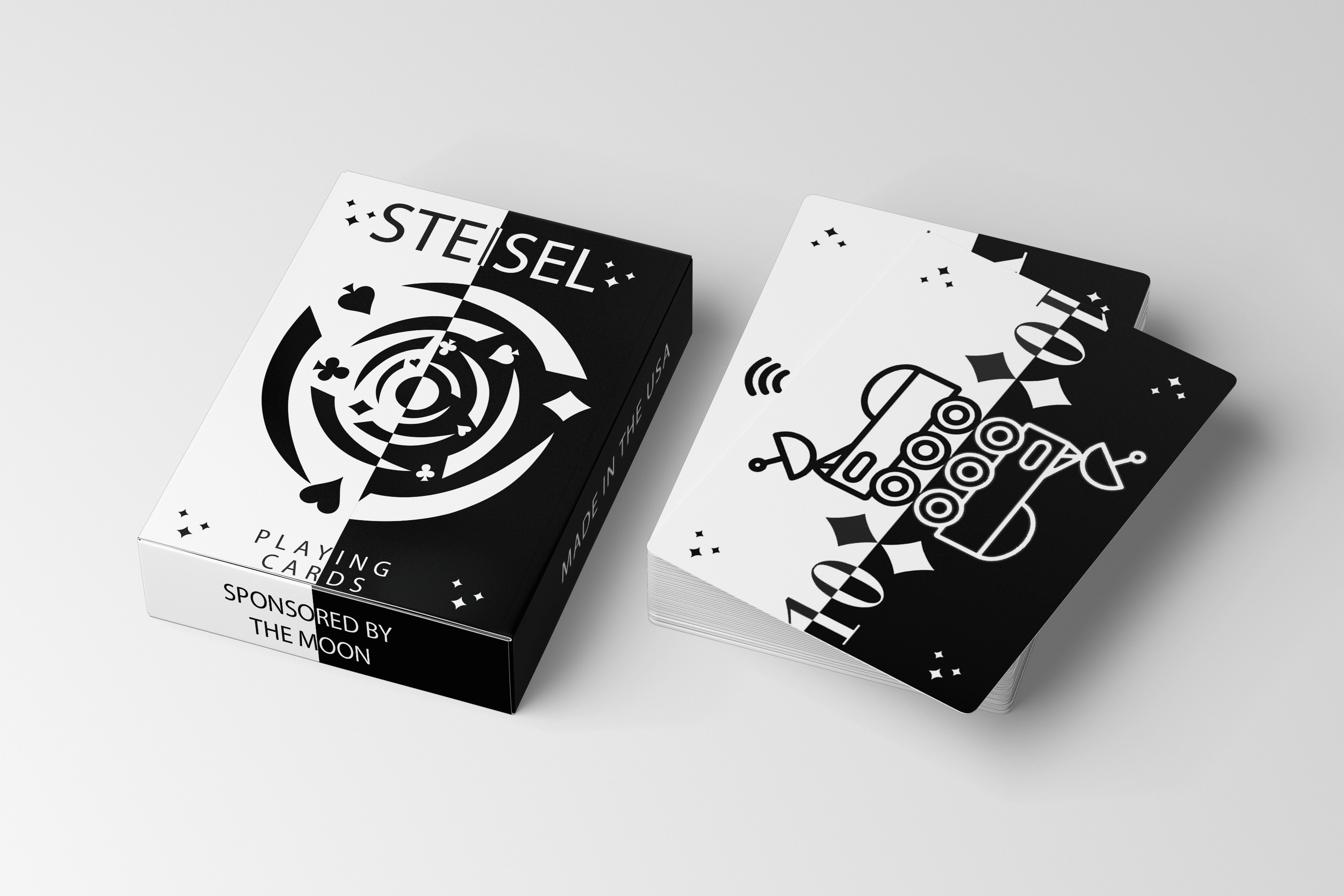


The Custom Playing Cards project was created to reimagine a traditional game through bold visuals and personalized design. I began by exploring the history and structure of standard card decks, identifying opportunities to modernize the experience while maintaining playability. The concept behind the project focused on turning an everyday object into a collectible art piece—one that blends function with personality, and tradition with innovation.
Each card was uniquely designed to reflect a cohesive visual theme, with stylized illustrations and a refreshed approach to suits and face cards. I developed a visual identity that combined playful iconography, vibrant color palettes, and modern type to create a deck that felt fresh and engaging. Supporting materials included mock packaging, promotional posters, and social media graphics to showcase the cards in action and highlight their versatility.
Typography choices were bold yet legible, contributing to a design that was both expressive and usable. Every detail—from corner indices to background textures—was carefully considered to enhance the user’s experience. This project demonstrates how design can elevate the ordinary, transforming a familiar format into a creative and memorable product.
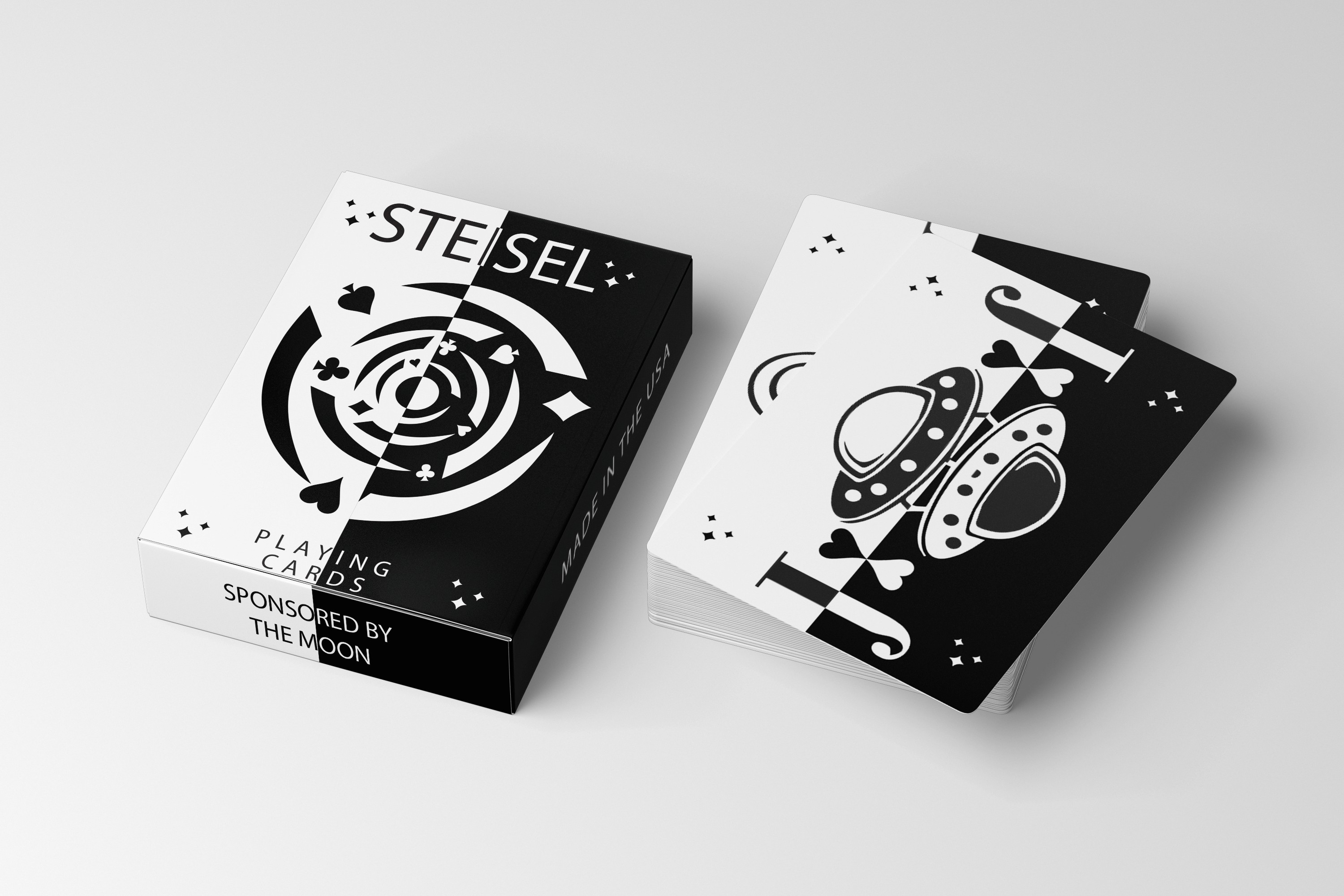
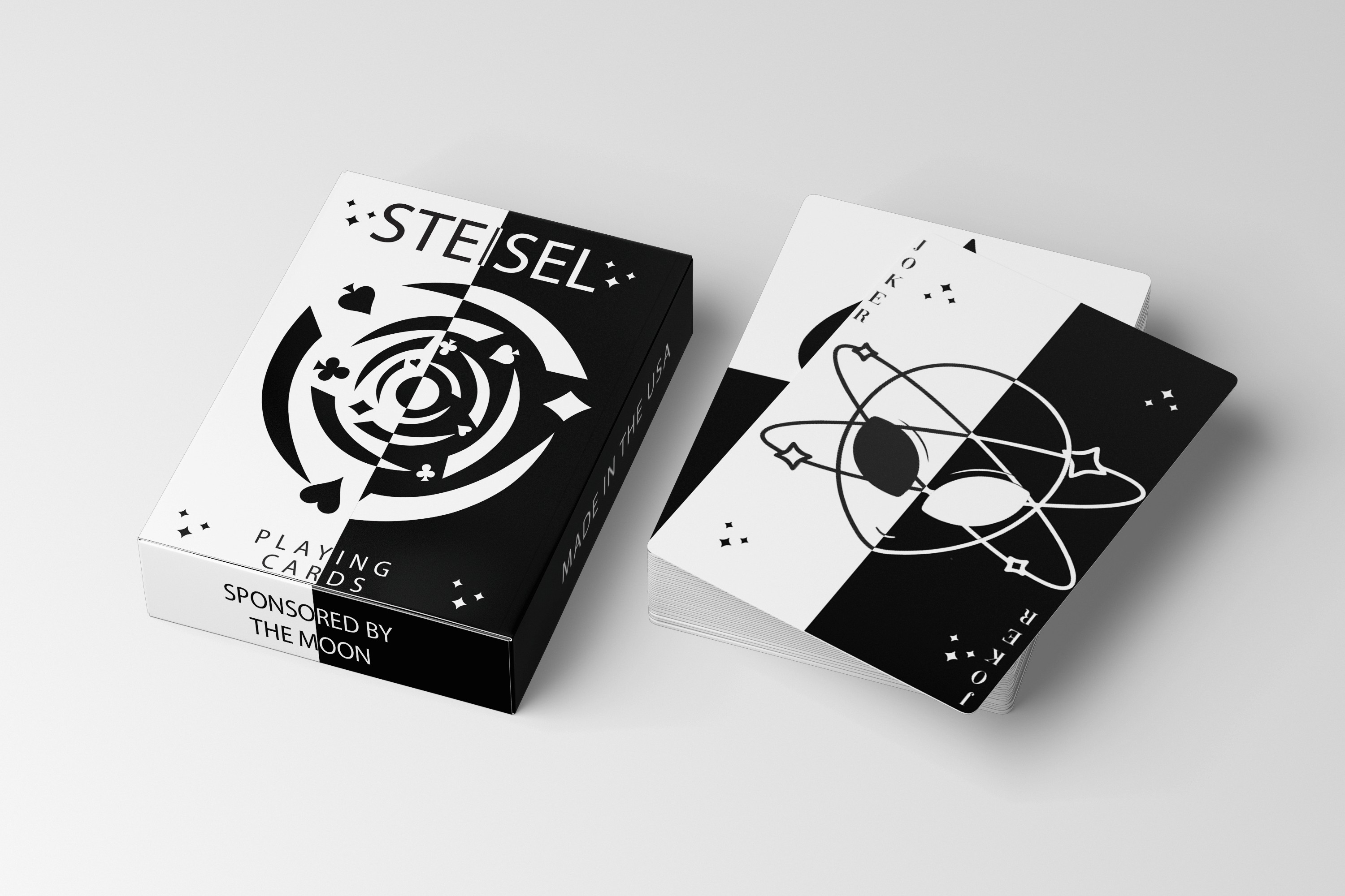
The NiteLight project was designed to raise environmental awareness through a clean, modern visual identity and campaign. I began by researching key environmental issues and identifying how design could communicate urgency while remaining approachable. The concept behind NiteLight centers on sustainability and the idea of "small actions creating big impact," symbolized by a single light in the dark. I developed a branding system that used dark backgrounds with soft, glowing accents to represent hope, energy conservation, and environmental change.
Typography was kept sleek and minimal, with carefully placed messaging that felt calm but powerful. I created a series of posters, social graphics, and mock packaging to promote the brand’s mission and encourage eco-conscious habits. Every design choice—from color palette to iconography—was made to evoke clarity, modernity, and environmental care. NiteLight showcases how thoughtful design can not only inform, but inspire action.