
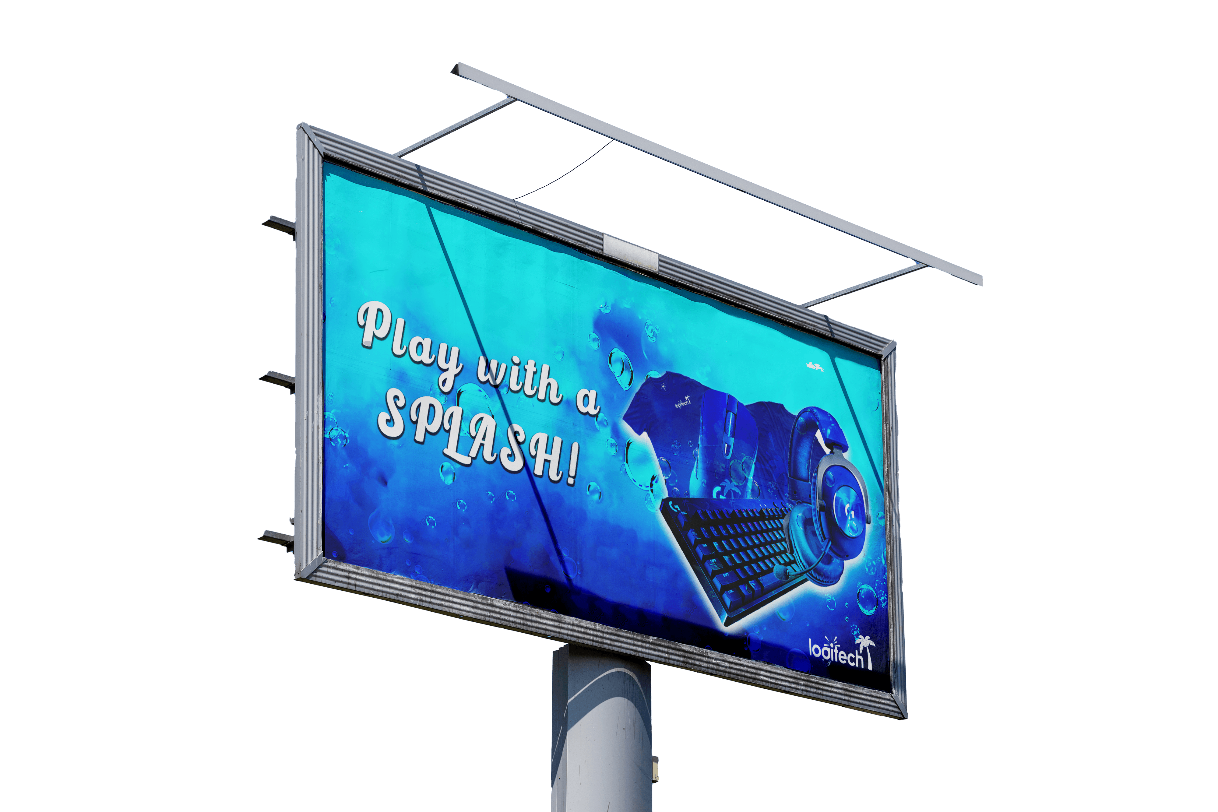


The goal of this project was to give Logitech a fresh, seasonal identity through a complete summer-themed rebrand. I started by researching the brand’s existing visual language to ensure my redesign stayed true to its core identity. From there, I explored color palettes that reflected a bold, energetic summer vibe—landing on a vibrant blue theme to unify the product line. I applied this palette across product packaging, promotional materials, and digital assets to create a cohesive look.
Typography and layout choices were kept clean and modern to align with Logitech’s tech-forward brand while adding a more playful, seasonal touch. I also incorporated soft gradients and abstract elements to give the visuals a breezy, summer feel without overwhelming the brand’s minimalist tone. The final result was a limited-time rebrand that felt exciting, refreshing, and still distinctly Logitech. This project highlights my ability to adapt an established identity while bringing in my own creative direction and style.