
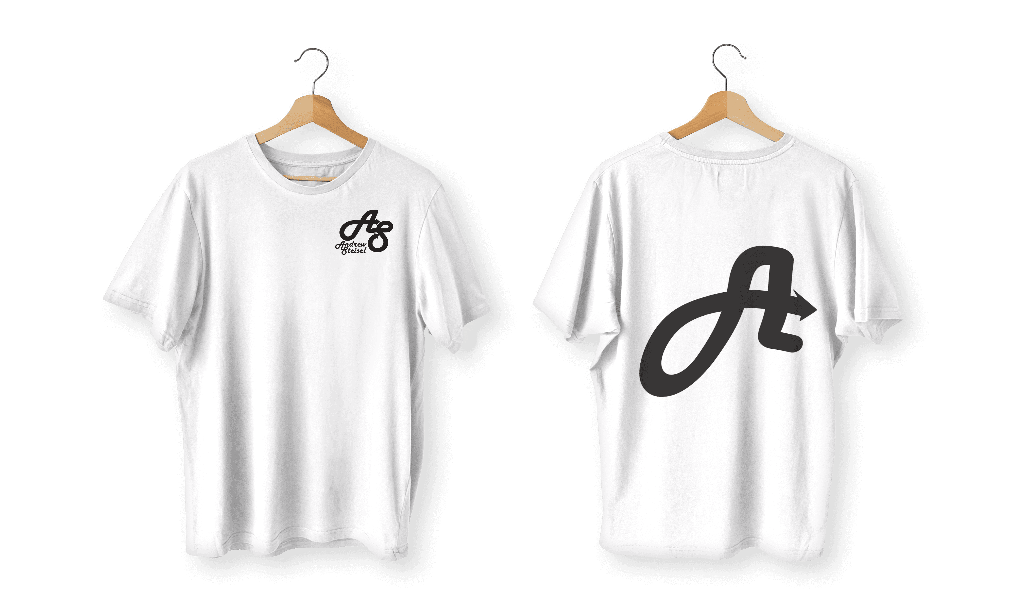
My Logo Description
I designed my logo to reflect my personality and creative mindset, using the initials “A” and “S” from my name, Andrew Steisel. I wanted the design to feel fluid and dynamic, so I used smooth curves that loop into each other, symbolizing constant movement and growth. The arrows built into the lettering represent progress and direction, which are two things I always aim for in both my design work and life in general. I went with a bold, clean look so it would stand out and be easily recognizable across any medium. The cursive type for my full name gives it a more personal, creative touch while still matching the flow of the main initials. It’s a balance between professional and playful, which fits who I am as a designer. Overall, it’s a mark that feels unique to me and something I’m proud to put on anything I create.
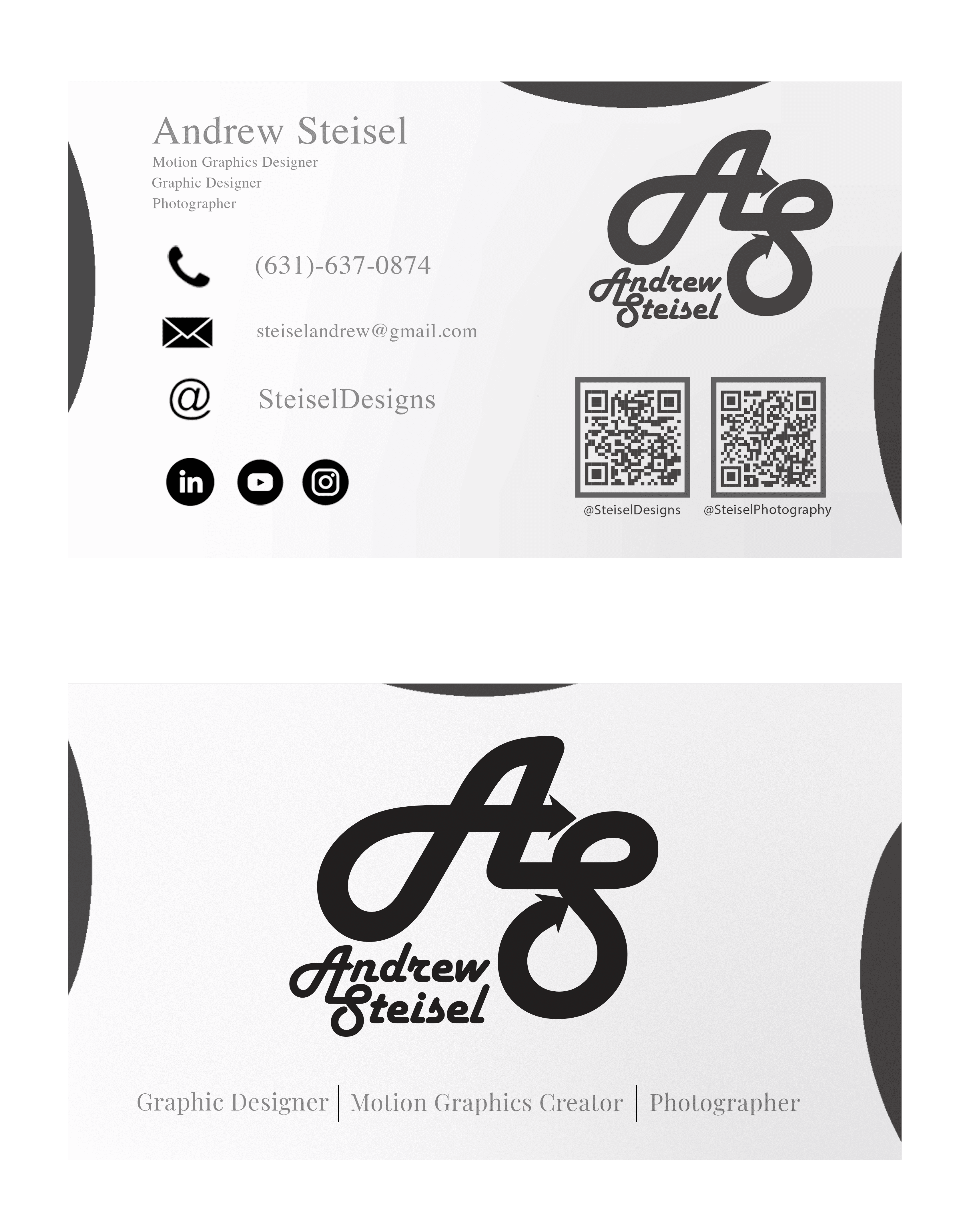
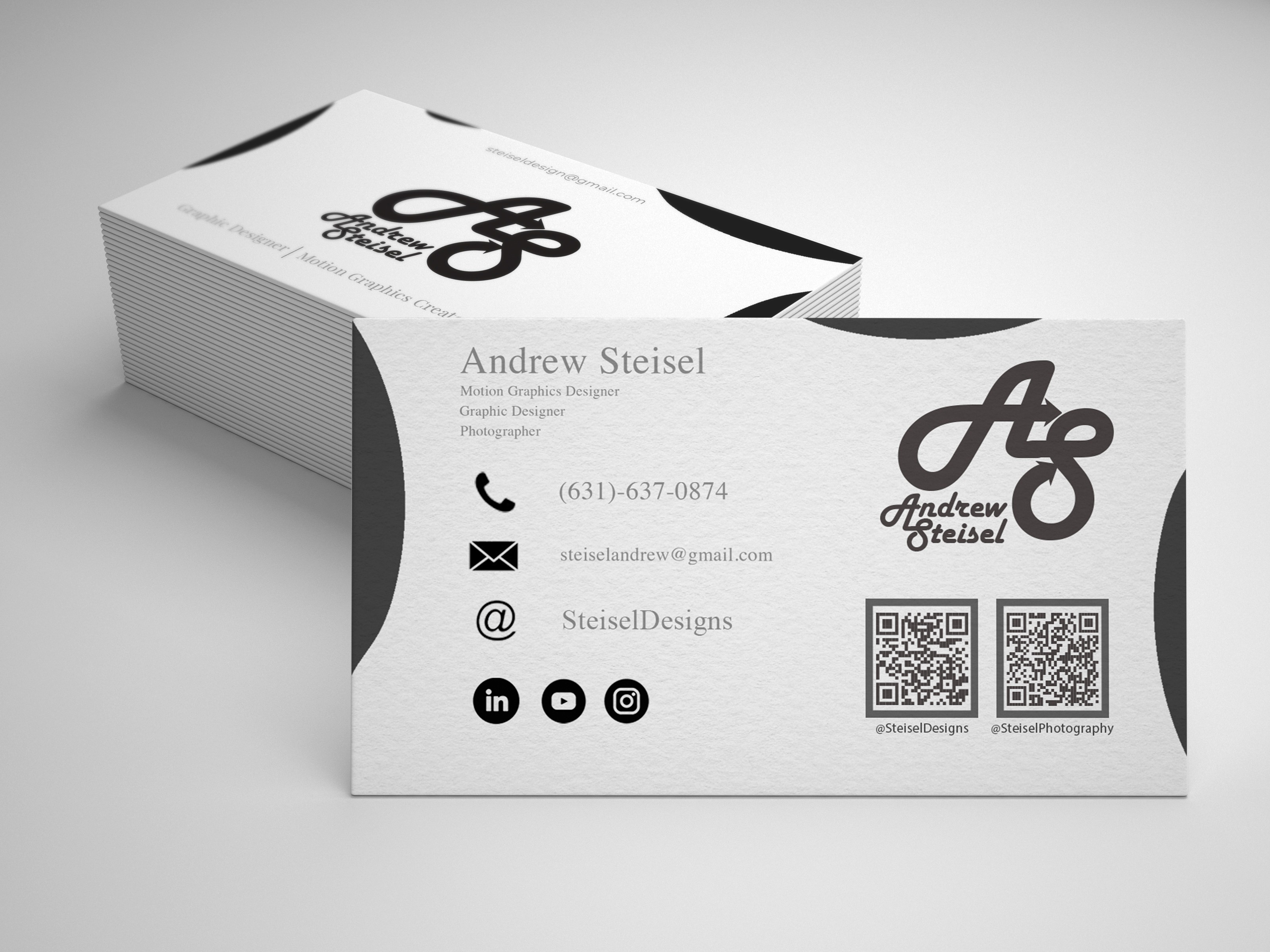