andrew steisel
graphic designer / photographer
Hello! My name is Andrew Steisel. I’m a graphic designer / photographer who brings a competitive edge to every project. Crafting bold, high-energy visuals that help brands stand out and win!
© Andrew Steisel 2026
design Work
Feel free to view some of my projects below!


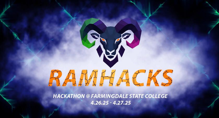
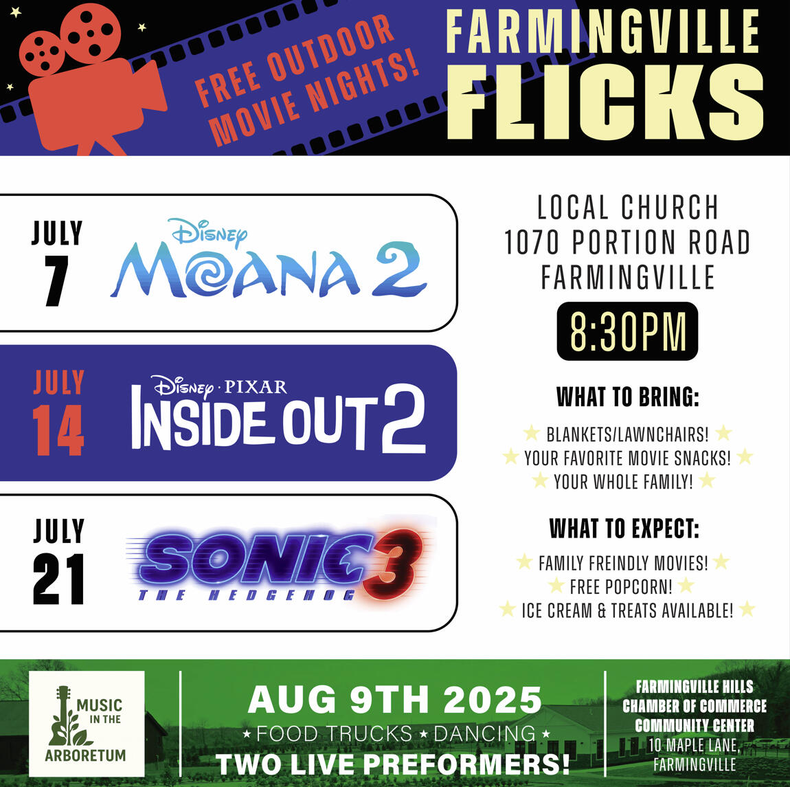
FSC RAMHACKS
RamHacks is the first hackathon in Farmingdale State College history to be hosted by a student led club, bringing together Long Island’s brightest tech minds in a dynamic, collaborative environment. As part of this landmark event, I was specifically asked to design the new logo, t-shirts, PowerPoint presentations, and daily event sheets to ensure a cohesive and professional visual identity for the highly anticipated hackathon.
The event united clubs and students from across the region to tackle creative programming challenges that tested problem solving, collaboration, and innovation. Designed to inspire learning and foster connections among future developers, RamHacks gave participants the opportunity to code real-world solutions, develop original projects, and network with peers and industry professionals.My designs aimed to capture the energy and excitement of the hackathon while maintaining clarity and approachability for attendees. From bold branding elements on the logo and apparel to organized, easy to follow presentation slides and daily schedules, each design supported a smooth and engaging event experience.RamHacks emphasized teamwork, ingenuity, and friendly competition in a high energy setting, making it a standout experience for all participants and marking an important milestone in FSC’s student led initiatives in tech!
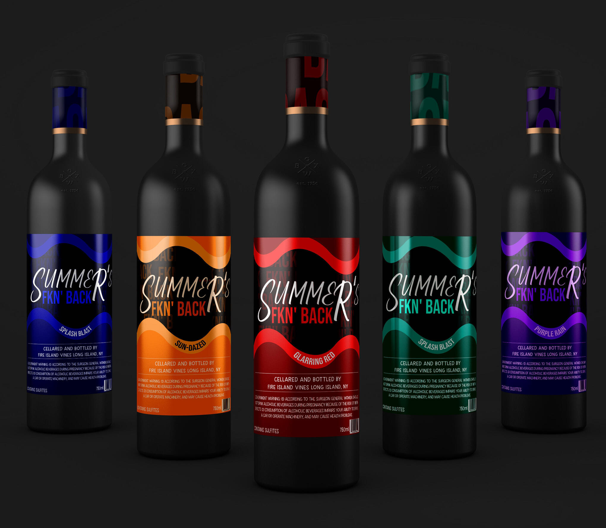
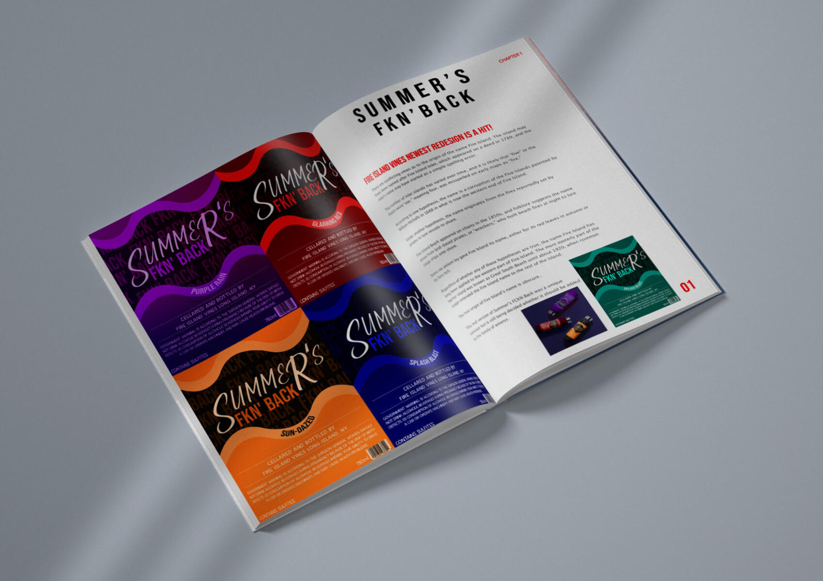
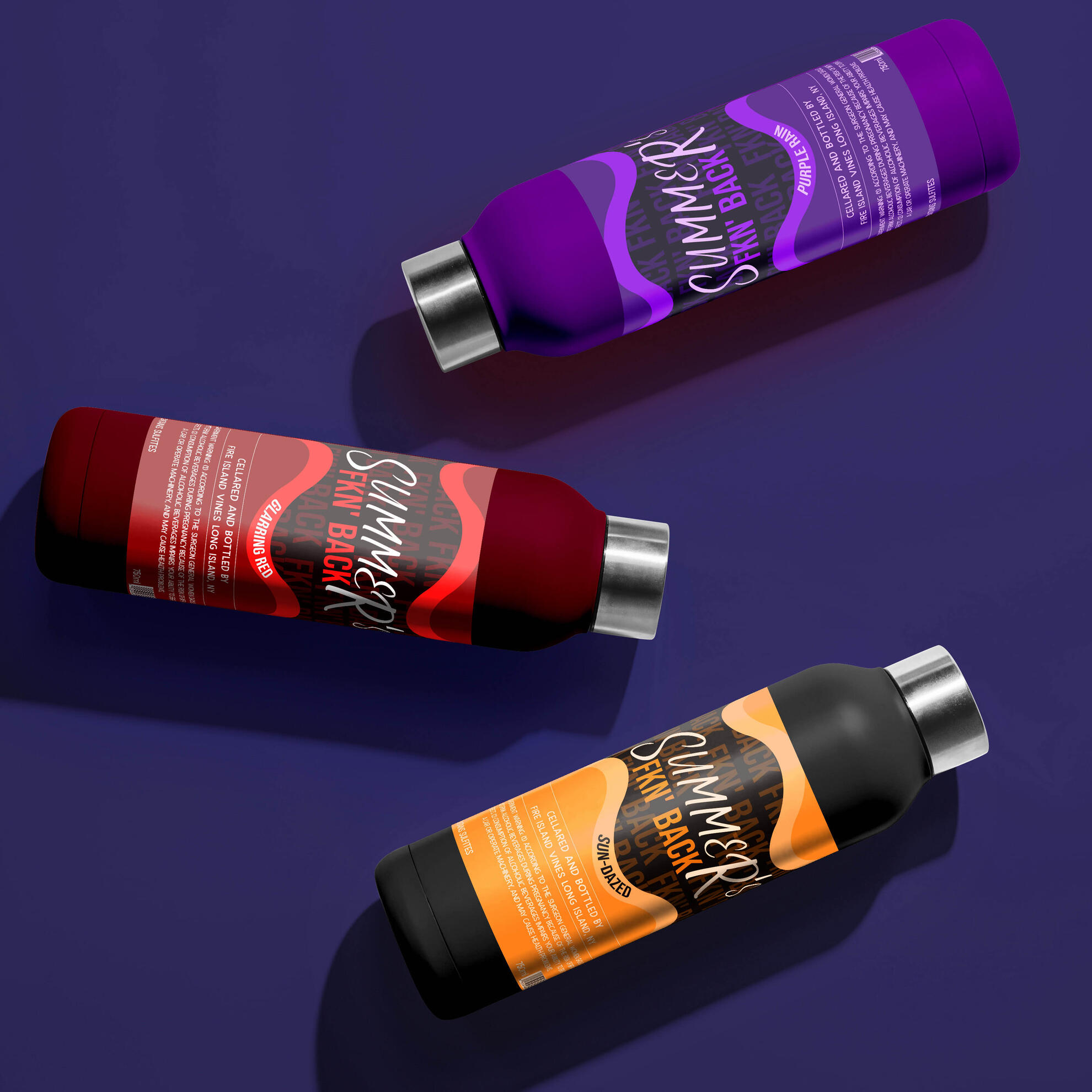
SUMMER'S FCKN' BACK
This project was completed as a college assignment, where the company was randomly selected from a hat for me to develop a new series of branding. I designed the Summer’s FKN’ Back wine series for Fire Island Vines to feel bold, confident, and unmistakably summer. Each bottle embraces vibrant, eye catching color theme paired with a wavy, energetic layout that mirrors the carefree, lively spirit of Fire Island summers!The edgy name, striking color contrasts, and handwritten style typography were all intentional choices to capture attention and convey a playful, rebellious energy. Each flavor; Glaring Red, Purple Rain, Splash Blast, and Sun-Dazed, were crafted to have distinct personalities, while maintaining a cohesive visual identity across the collection.
This series was designed to stand out on shelves and at summer gatherings, from beach bars to backyard parties, giving Fire Island Vines a bold, memorable, and fun brand presence that perfectly embodies the energy of the season!
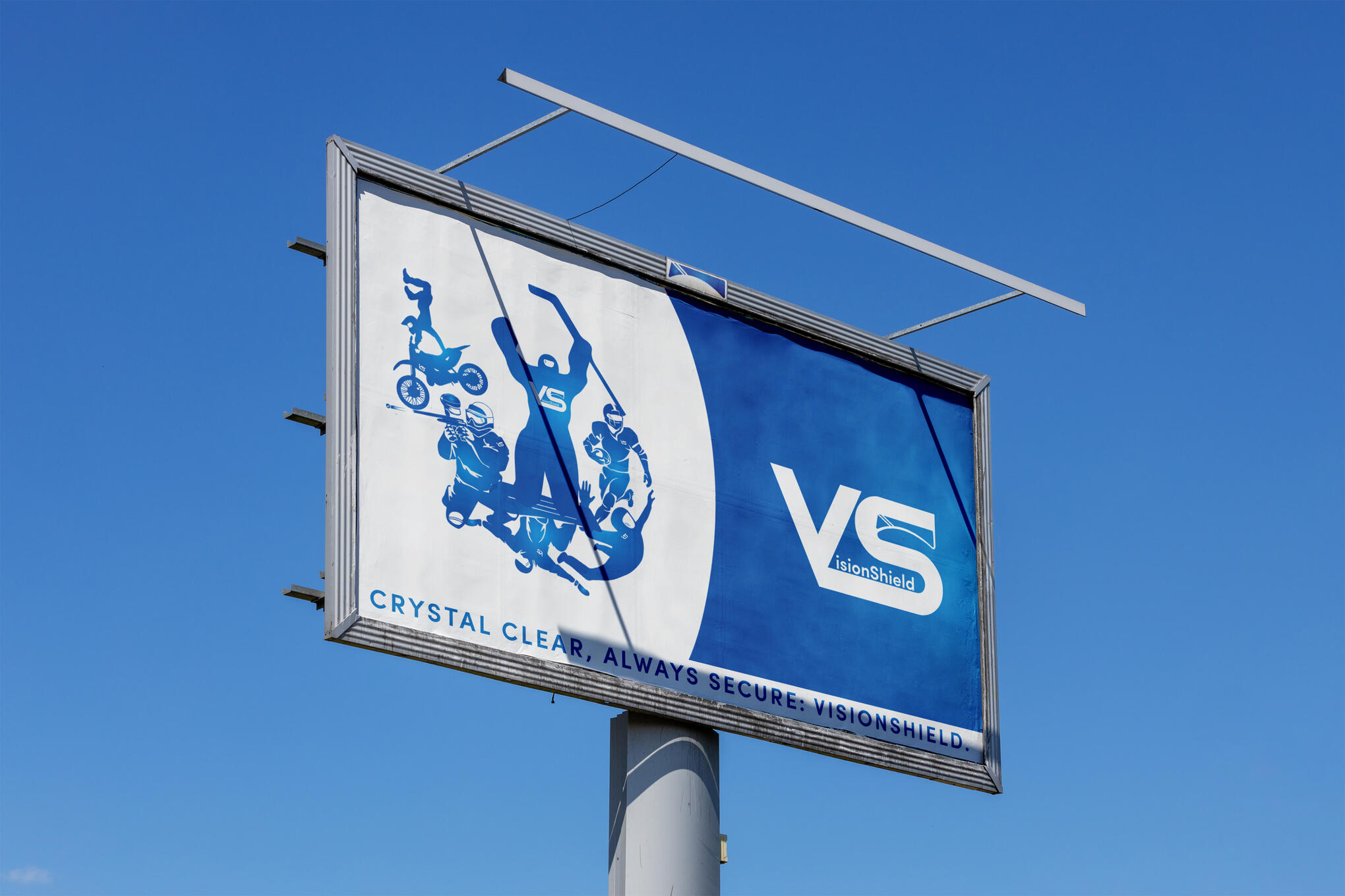
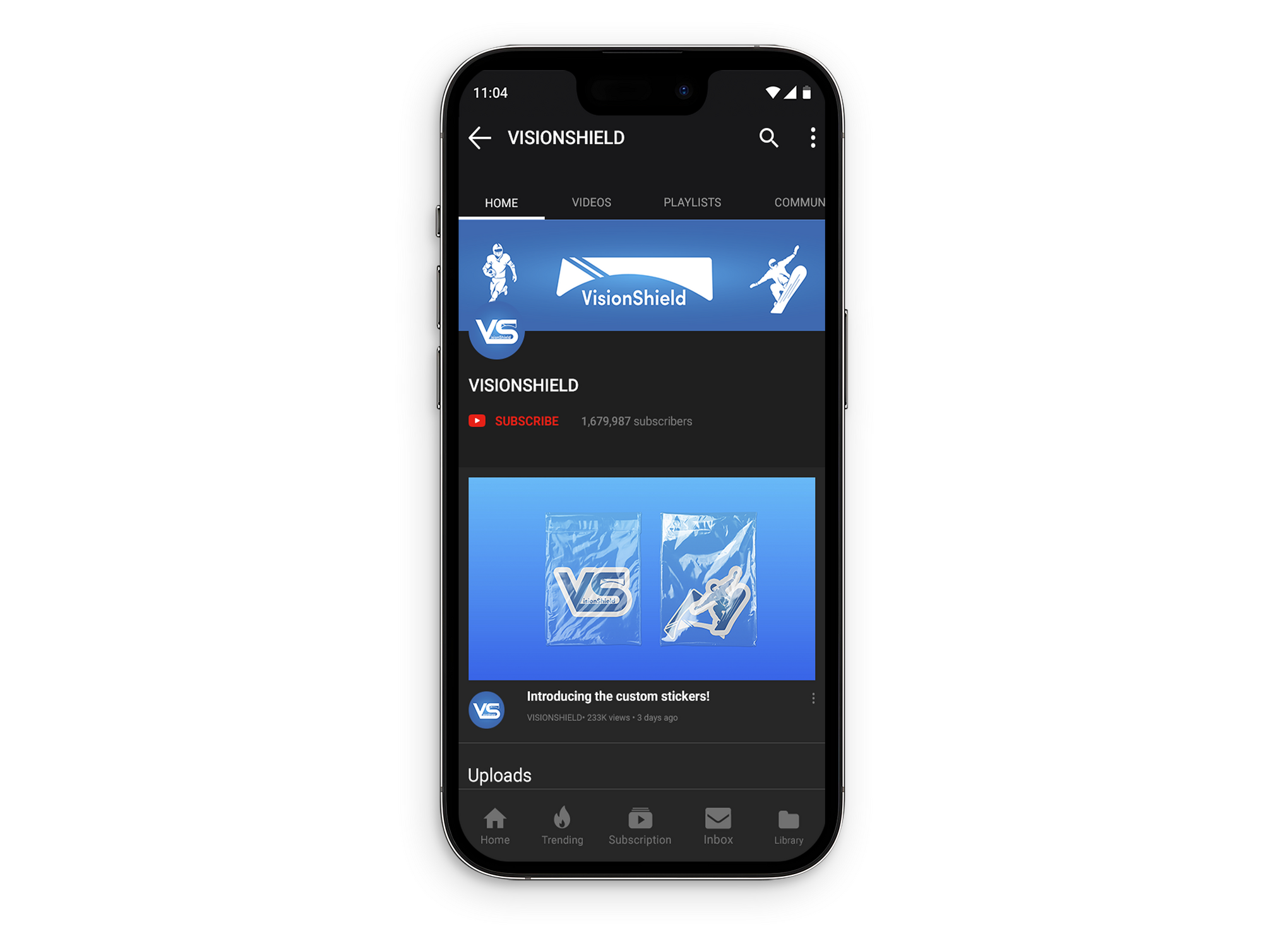
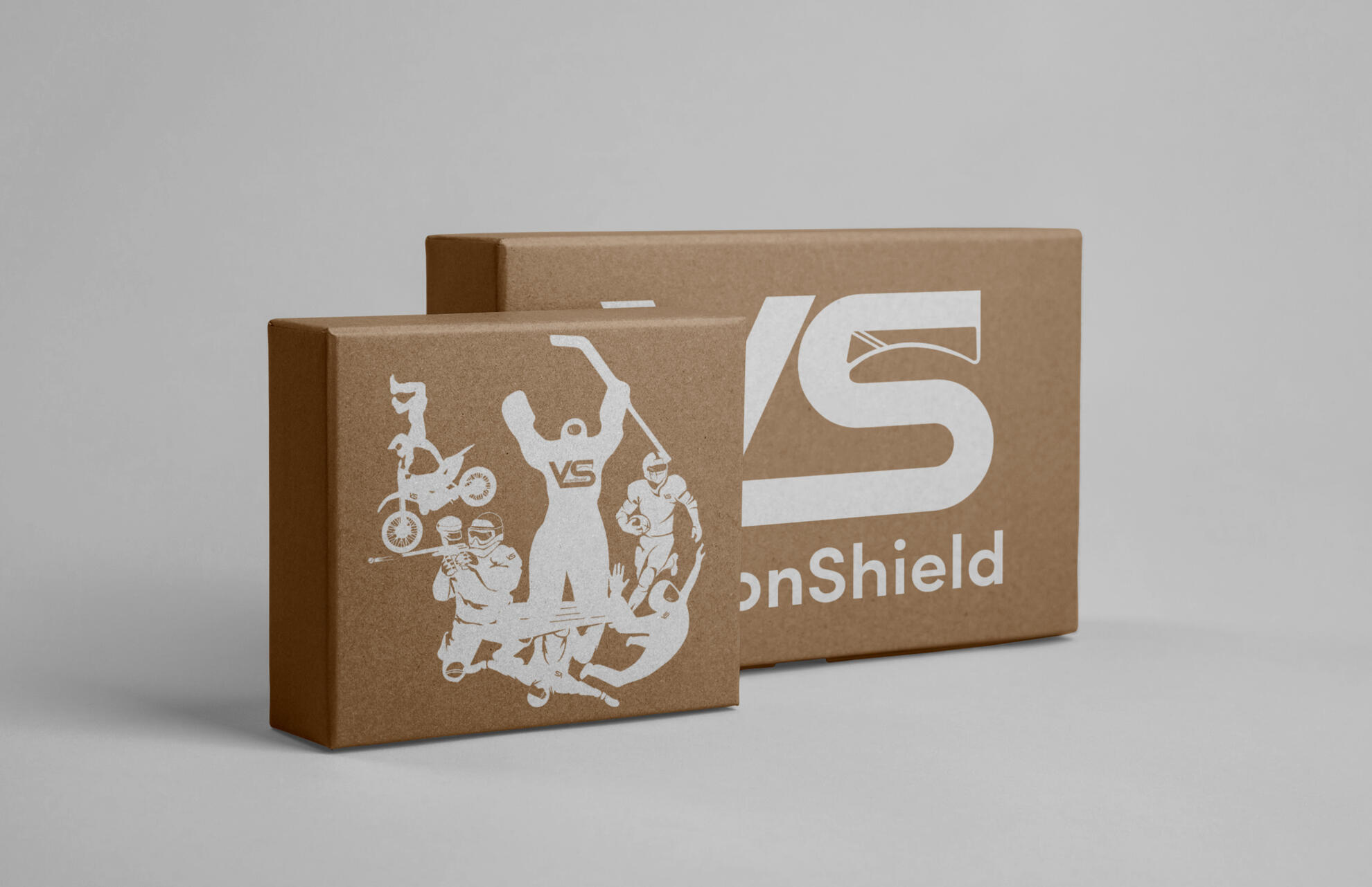
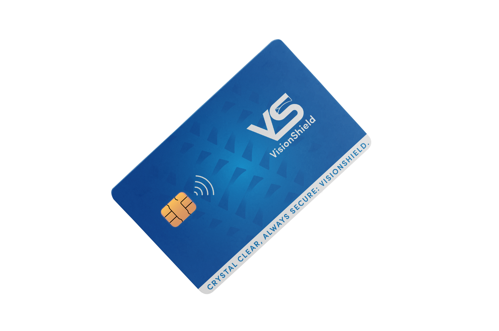
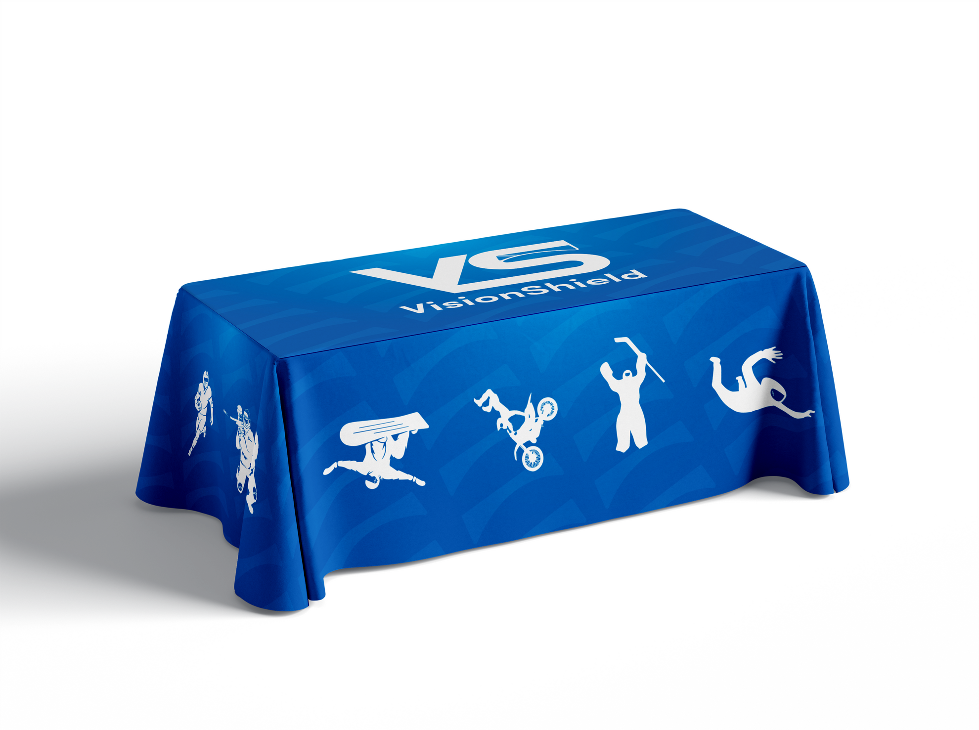
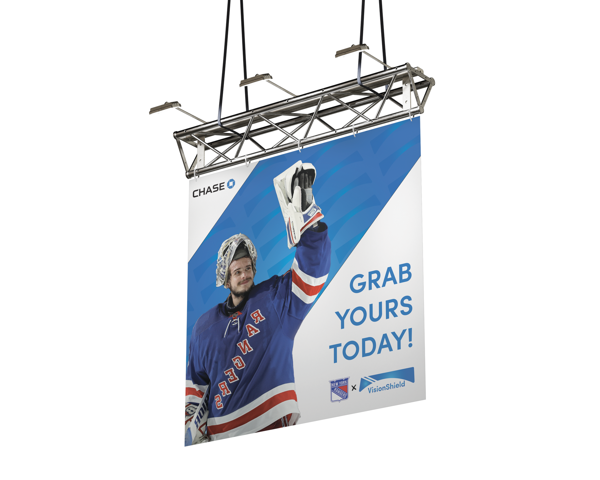
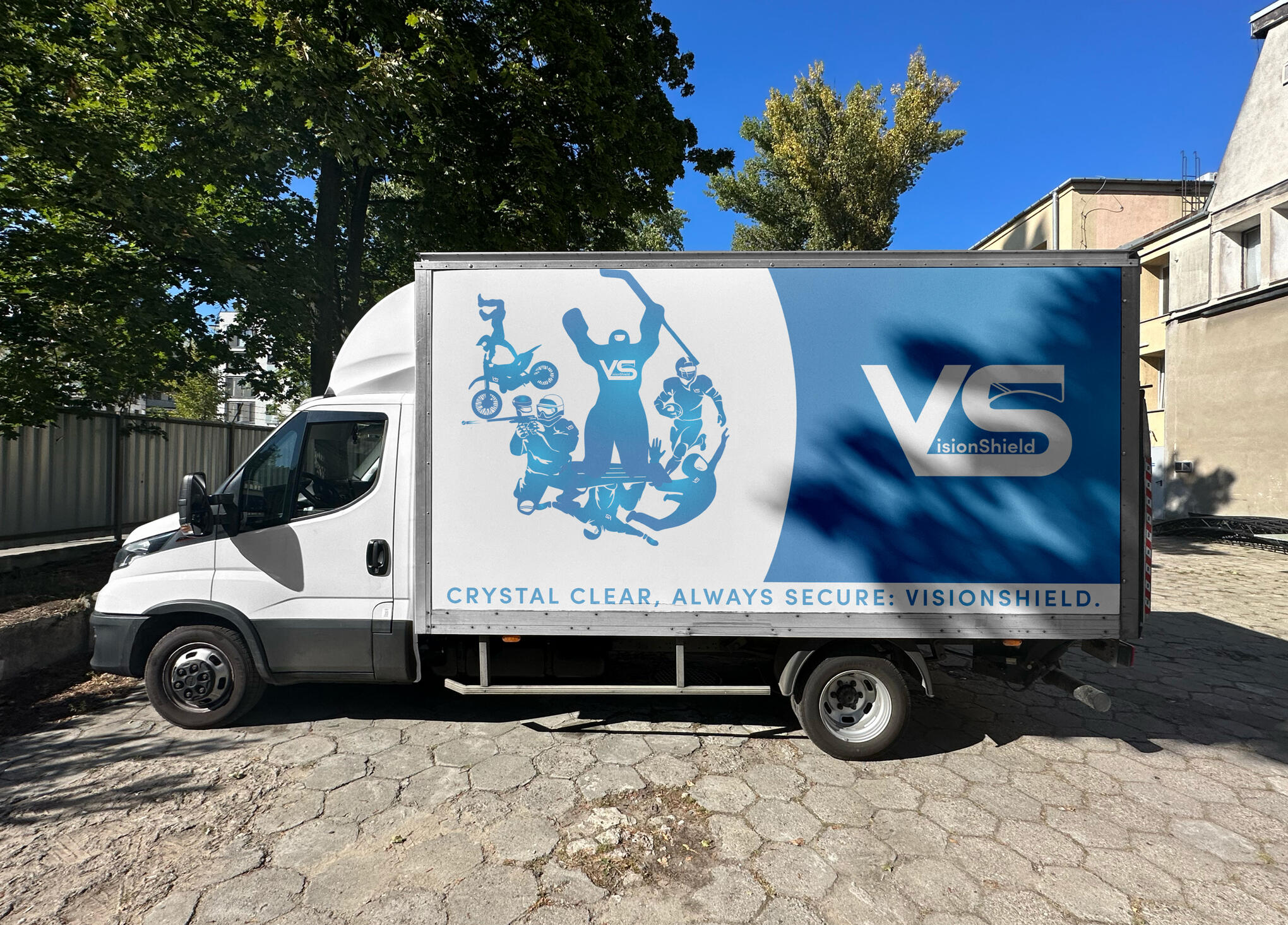
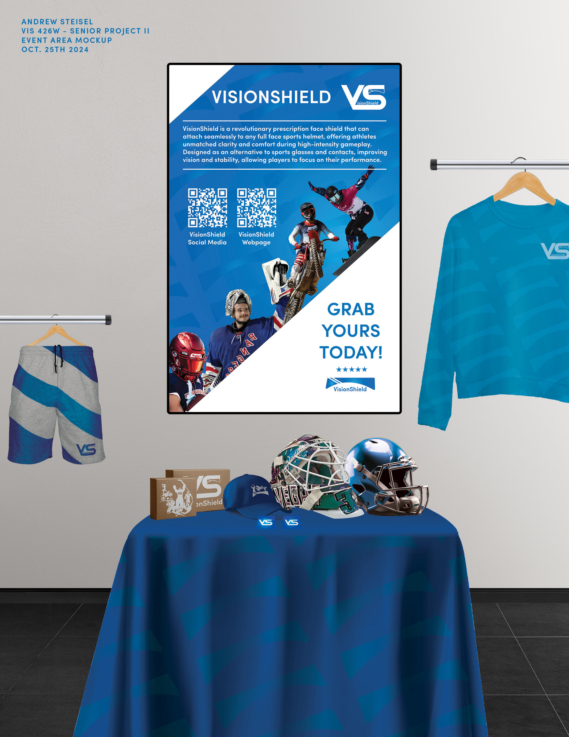
VISIONSHIELD
VisionShield is an innovative solution for athletes who require vision correction, offering prescription face shields that seamlessly attach to full face helmets for enhanced performance, safety, and comfort. Designed for high intensity sports such as hockey, football, and skydiving, VisionShield integrates corrective lenses directly into protective gear, eliminating the need for glasses or contact lenses that can shift, fog, or cause discomfort during play!As part of the project, a working prototype was designed, created, and tested by real users who expressed interest in the product’s innovation. Feedback from these test users informed design refinements, helping to improve comfort, clarity, and usability in active environments. By combining athlete-driven testing with durable, impact resistant materials, VisionShield ensures consistent vision in fast paced conditions - allowing athletes to stay focused, confident, and fully immersed in their performance!To view the entire project - please hit the project link below!
custom playing cards
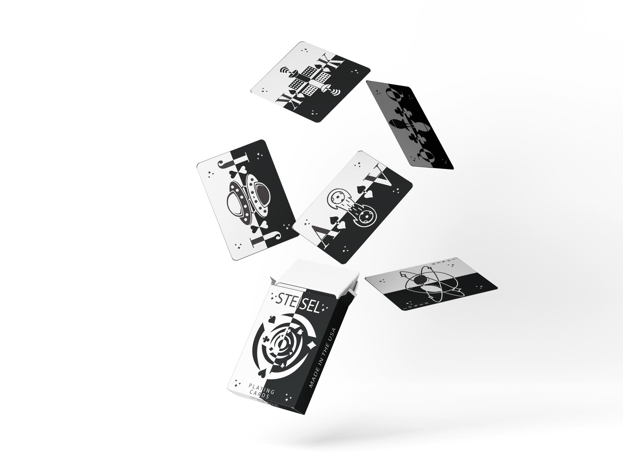
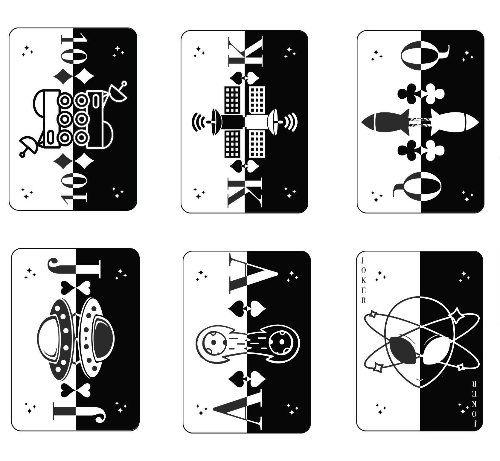
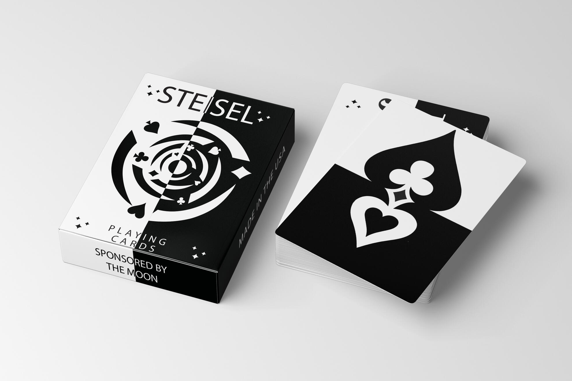
The Custom Playing Cards project was created to reimagine a traditional game through bold visuals and personalized design. I began by exploring the history and structure of standard card decks, identifying opportunities to modernize the experience while maintaining playability. The concept behind the project focused on turning an everyday object into a collectible art piece - one that blends function with personality, and tradition with innovation.Each card was uniquely designed to reflect a cohesive visual theme, with stylized illustrations and a refreshed approach to suits and face cards. I developed a visual identity that combined playful iconography, vibrant color palettes, and modern type to create a deck that felt fresh and engaging. Supporting materials included mock packaging, promotional posters, and social media graphics to showcase the cards in action and highlight their versatility.This project demonstrates how my design can elevate from the ordinary, transforming a familiar format into a creative and memorable product!
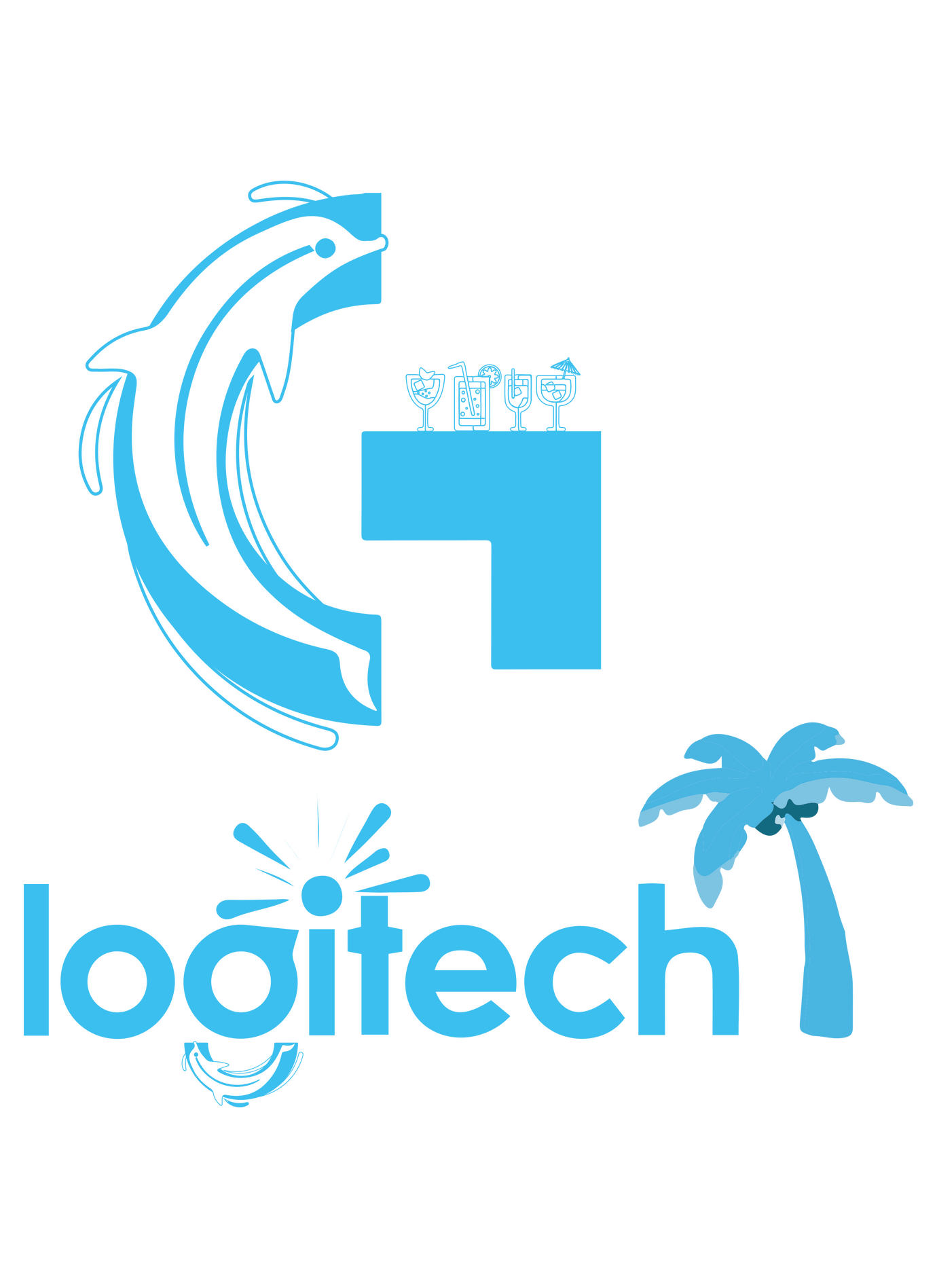
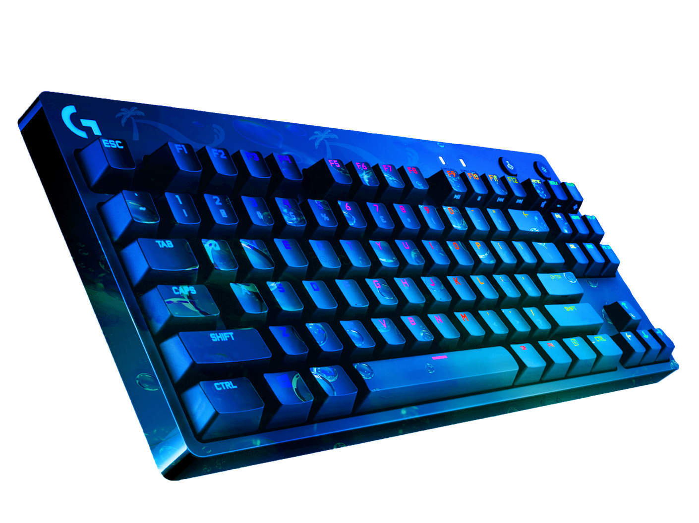
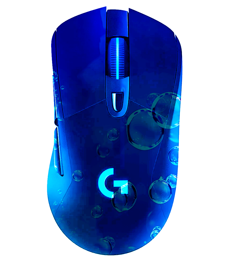
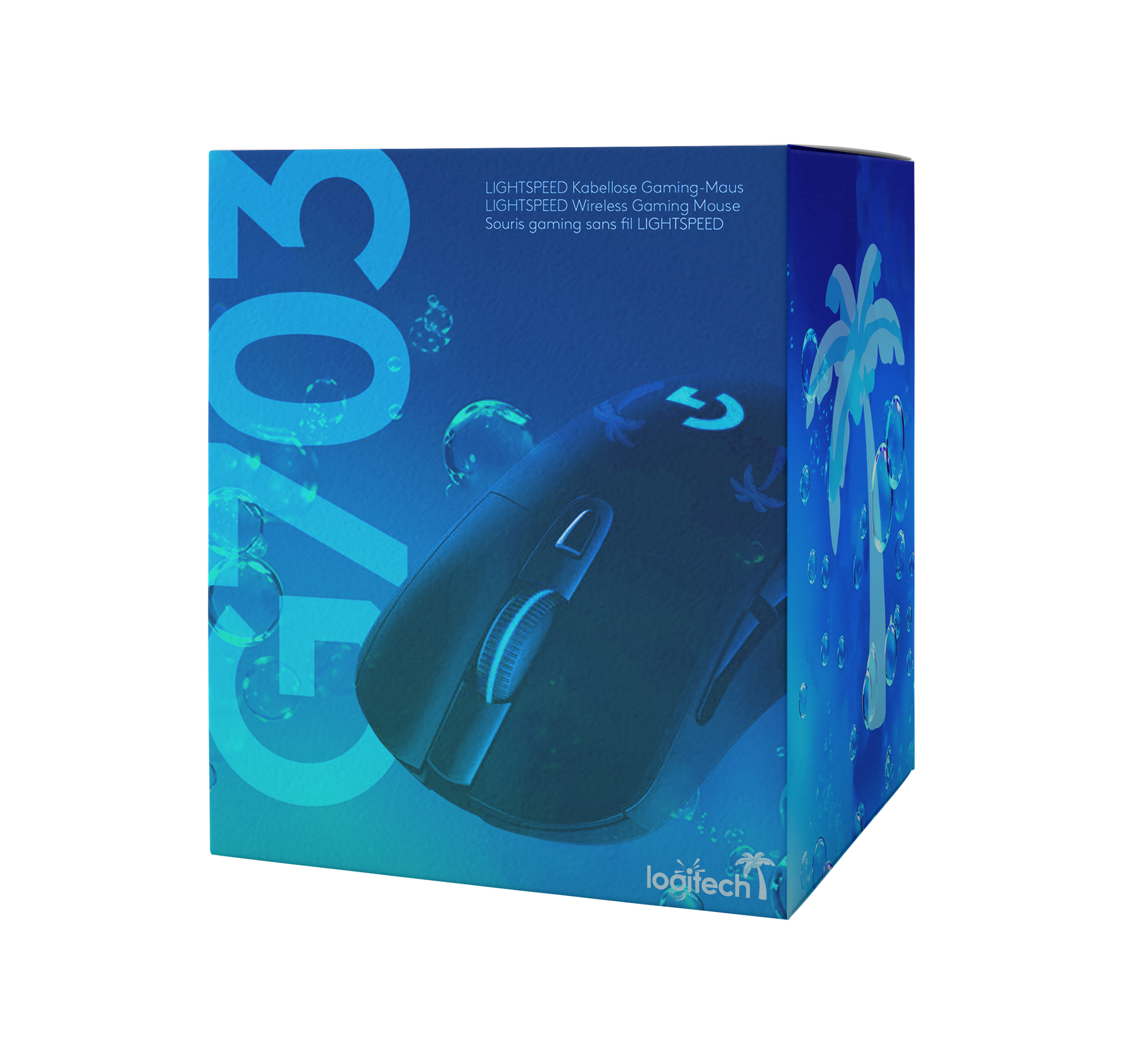
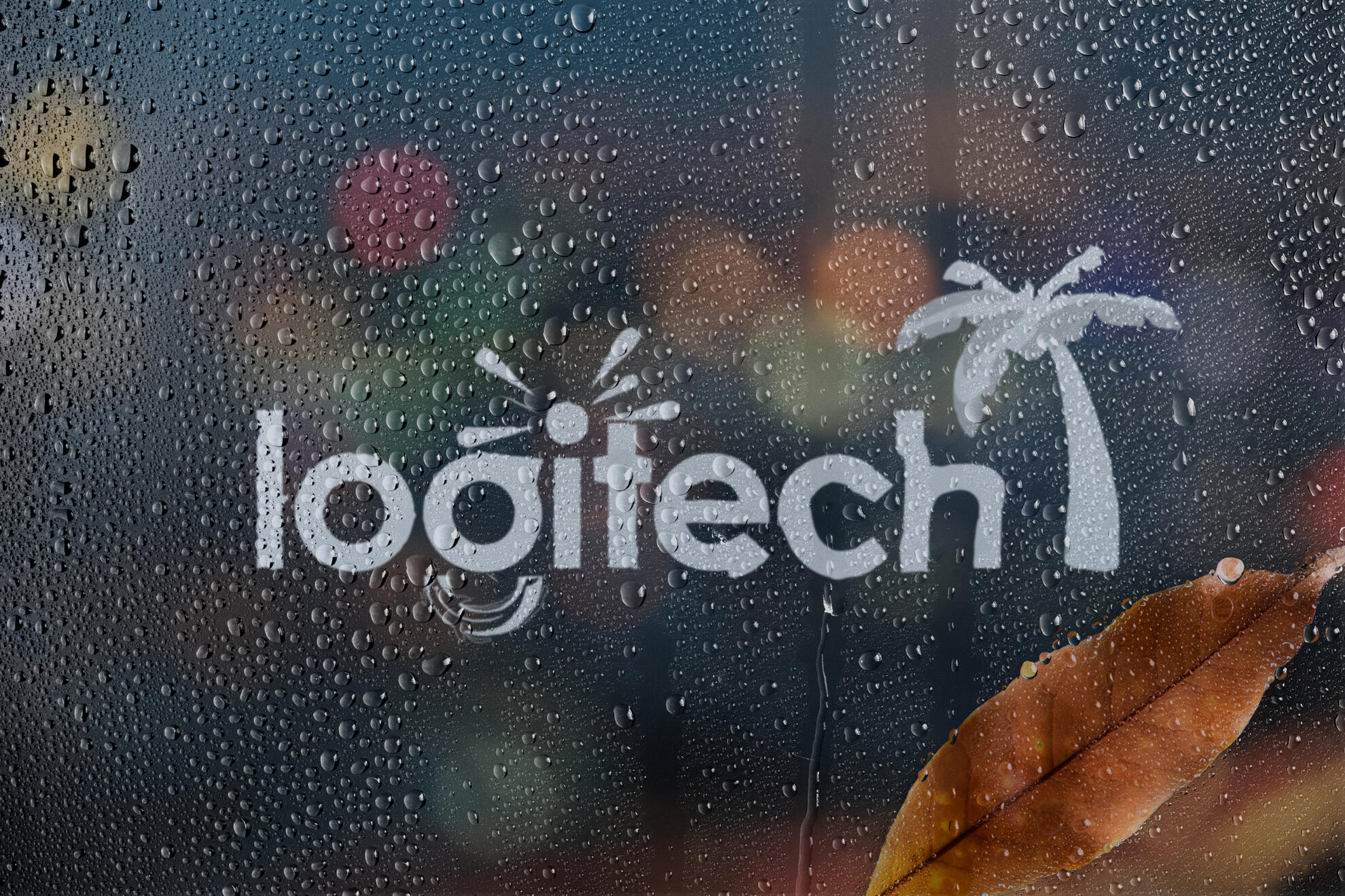
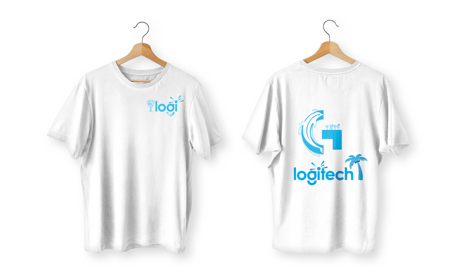
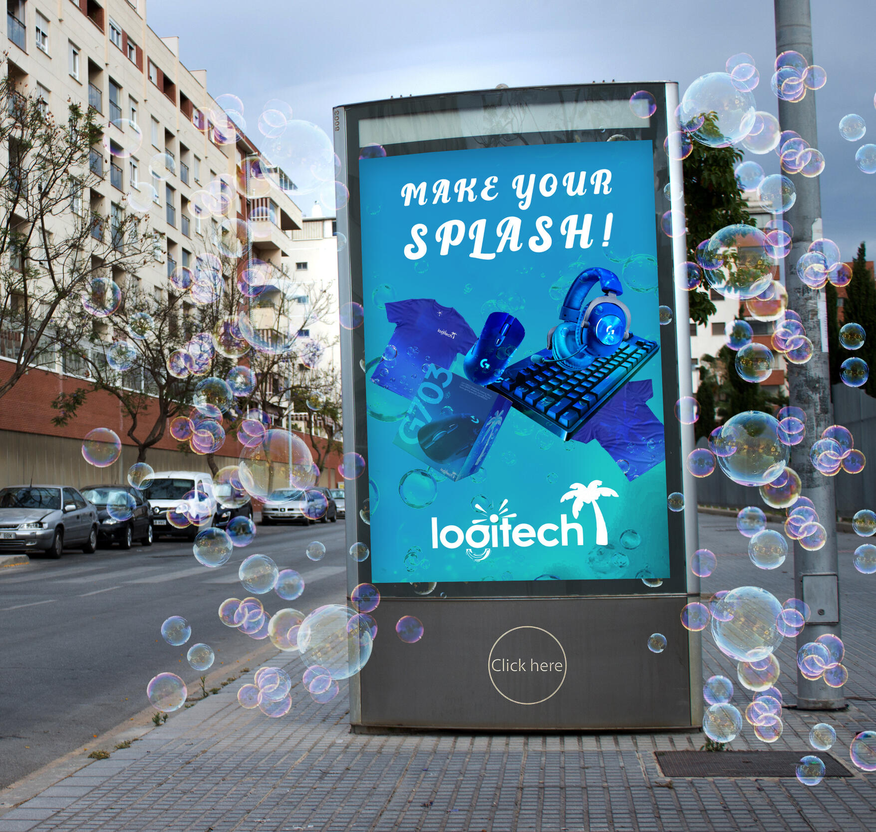
Logitech rebranding
The goal of this project was to give Logitech a fresh, seasonal identity through a complete summer-themed rebrand. I started by researching the brand’s existing visual language to ensure my redesign stayed true to its core identity. From there, I explored color palettes that reflected a bold, energetic summer vibe - landing on a vibrant blue theme to unify the product line. I applied this palette across product packaging, promotional materials, and digital assets to create a cohesive look. Typography and layout choices were kept clean and modern to align with Logitech’s tech forward brand while adding a more playful, seasonal touch.I had also incorporated soft gradients and abstract elements to give the visuals a breezy, summer feel without overwhelming the brand’s minimalist tone. The final result was a limited time rebrand that felt exciting, refreshing, and still distinctly Logitech. This project highlights my ability to adapt an established identity while bringing in my own creative direction and style!


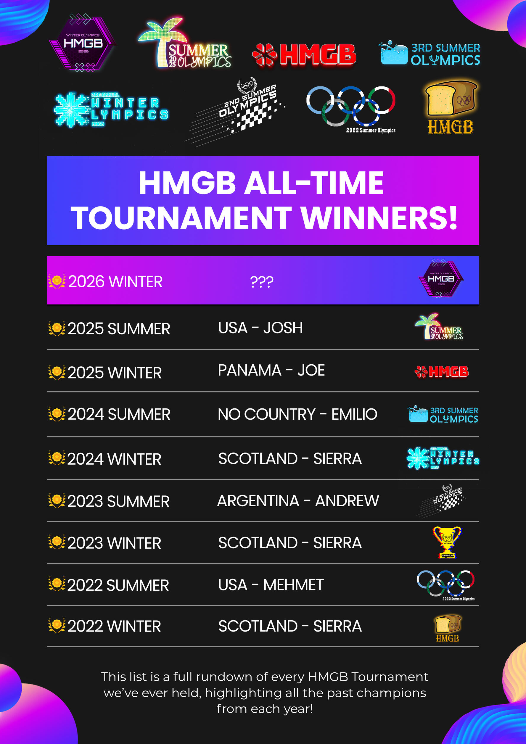
Olympic tournaments
For the year of 2025, my friend group and I are organizing our very own Olympic tournaments - fun, competitive events designed to bring everyone together and make memories together. Inspired by the spirit of the real Olympic Games, our version will feature a wide range of events including classic sports along with some creative challenges. Each person will compete for points as part of a team, with medals and bragging rights on the line.We’ve put time into planning the matchups, designing team uniforms, and even setting up a schedule to keep everything fair and exciting. The goal isn’t just to win - it’s to create memories, share laughs, and enjoy the thrill of competition in a laid-back, friendly environment. Whether you're an athlete or just in it for the fun, these Olympic tournaments will be the highlight of the year!
freelance projects
I’ve had the opportunity to collaborate with a wide range of business owners, creating custom design solutions that reflect each brand’s unique goals and personality. My freelance work spans diverse industries and styles, from designing eye catching signage for a Signarama client to crafting an architectural advertisement for a local magazine, allowing me to adapt quickly and deliver visuals that succeed in the real world!Each project is approached with creativity, flexibility, and a focus on meaningful results. Whether it’s developing a full brand identity, producing digital content, or designing print campaigns, I aim to create work that is not only visually striking but also strategically effective.
By combining thoughtful design, attention to detail, and an understanding of each client’s audience, I ensure every project makes a lasting impact - turning ideas into visuals that truly resonate!

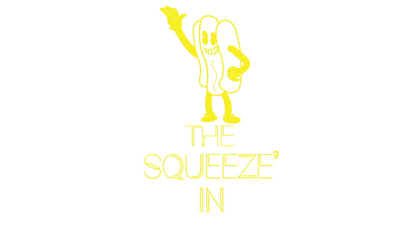
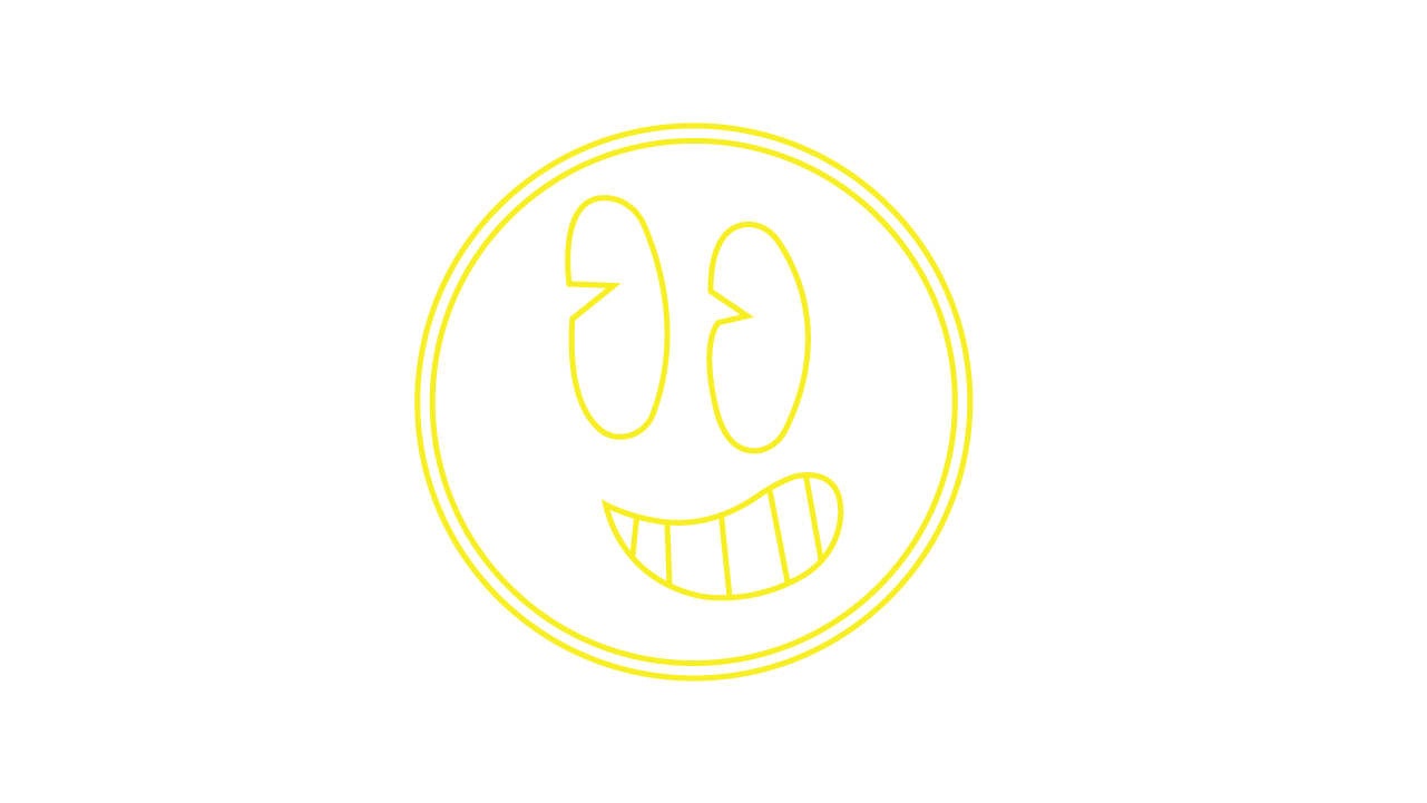
the squeeze in -
company rebranding
The Squeeze In was a collaborative college branding project focused on a full identity redesign for a small hot dog restaurant in Pennsylvania. Working alongside three classmates, we partnered with a real client and met weekly over five Zoom meetings to develop and refine the brand direction. Each designer was assigned specific creative constraints, requiring us to balance personal creativity with real world client needs and expectations.
The core concept centered on refreshing the restaurant’s identity while keeping it approachable and familiar. At the owner’s request, I designed the brand using a San Diego Padres inspired color palette, blending East Coast comfort food culture with a bold West Coast influence. This unexpected combination helped the brand stand out while still feeling grounded and authentic!Color played a major role in shaping the brand’s personality. Rich browns, warm golds, and soft creams were used to create a nostalgic yet sporty aesthetic - one that feels welcoming, energetic, and fun. These choices were applied consistently across the logo, typography, signage, and packaging to establish a cohesive and recognizable visual system. The overall design approach focused on being playful yet clean, capturing the casual energy of a go to neighborhood spot while elevating its visual presence. Every element was designed to feel inviting and full of personality, reflecting the warmth of the food and the character of the business itself.The Squeeze In rebrand demonstrates my ability to work within a team, collaborate with a real client, and translate a specific theme into a cohesive visual identity. By balancing creative freedom with client direction, the project resulted in a memorable, approachable brand that feels both fresh and authentic while showcasing how thoughtful design can strengthen a small business’s presence and connection with its audience!

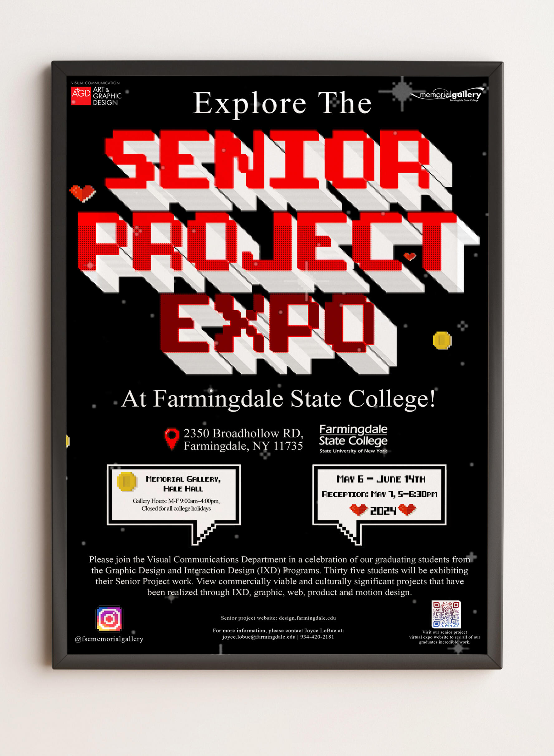
senior project expo poster design
This poster was created for the 2025 Senior Project Expo for the Visual Communications Department at Farmingdale State College as part of a student design competition. Senior designers were challenged to develop a new and exciting visual style that would redefine the annual event and capture the creativity of the graduating class. My design focused on creating a bold, engaging presence that reflects both innovation and professionalism, aiming to attract attendees while celebrating student work. The poster received 2nd place in the competition, falling short by just one vote, with voting open to both students and faculty, highlighting its strong reception across the department!
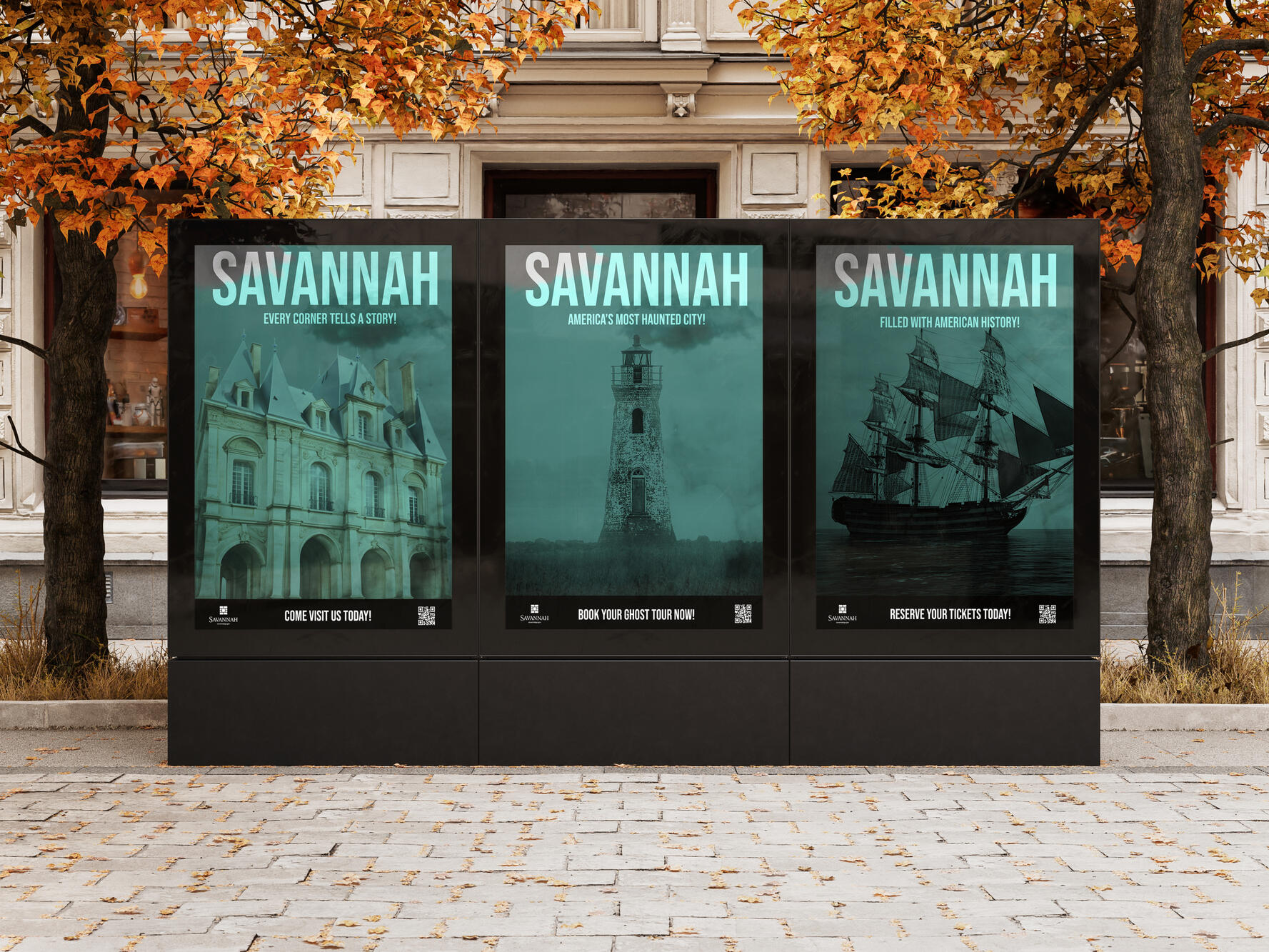
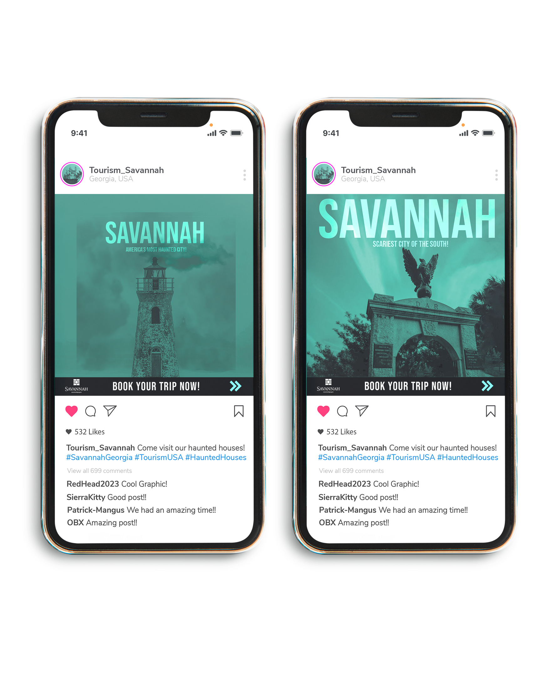
savannah georgia -tourism advertising
This project reimagines how Savannah, Georgia is advertised by uncovering a lesser-known side of the city - its reputation as one of the most haunted locations in the United States. Rather than focusing on traditional tourism imagery, the campaign leans into Savannah’s eerie history to spark curiosity and intrigue among new audiences.
The concept centers on storytelling through atmosphere. Each poster and banner highlights Savannah’s haunted identity, transforming historical locations and familiar landmarks into visually compelling narratives that feel mysterious and unsettling. By reframing the city through a supernatural lens, the campaign invites viewers to experience Savannah in an unexpected and memorable way!A grim green color palette was applied consistently across all designs to visually communicate the city’s haunted nature. This intentional color treatment creates a chilling tone while unifying the campaign across multiple formats. The restrained use of color enhances the emotional impact and reinforces the theme without overwhelming the viewer. Modern layout choices and bold typography balance the darker visuals, ensuring the campaign remains professional, readable, and effective as tourism advertising. The clean structure allows the haunting visuals to stand out while maintaining clarity and cohesion across all materials.Overall, this campaign challenges conventional travel advertising by embracing Savannah’s haunted identity as its strongest asset. By combining atmospheric visuals, intentional color choices, and cohesive design systems, the project successfully presents Savannah, Georgia as a destination that is both historically rich and thrilling - inviting new visitors to explore a side of the city they never knew existed!
guggenheim museum advertising project
This project reimagines how the Guggenheim Museum connects with new audiences through contemporary advertising. Rather than relying on traditional promotional imagery, the campaign draws directly from the museum’s own collection, positioning the artwork itself as the main voice of the message. This approach transforms familiar pieces into bold invitations, sparking curiosity and encouraging viewers to experience the art in person!A key concept of the campaign is using artwork found within the museum in a fresh, unexpected way. By reframing iconic works as advertising visuals, the designs blur the line between exhibition and promotion, allowing the art to exist beyond the gallery walls. This strategy aims to attract new visitors by presenting the Guggenheim as accessible, dynamic, and visually relevant!Color plays a central role in unifying the campaign. Carefully selected palettes complement the artwork without overpowering it, enhancing contrast and readability while maintaining a refined, contemporary feel. These choices help the ads stand out in digital and print environments while preserving the integrity of the original art. Layout and typography were designed with a modern, professional approach, emphasizing clarity and hierarchy across mobile ads and flyers. Clean spacing, strong alignment, and balanced composition ensure consistency throughout the campaign, reinforcing the Guggenheim’s identity while delivering an engaging, polished visual experience!Overall, this campaign successfully transforms the Guggenheim’s existing artwork into a powerful advertising tool, blending concept, color, and layout to create a cohesive and contemporary visual identity. By extending the museum’s art beyond its walls and into everyday spaces, the project invites new audiences to engage with the Guggenheim in an approachable and exciting way, reinforcing the museum’s relevance as a modern cultural destination!

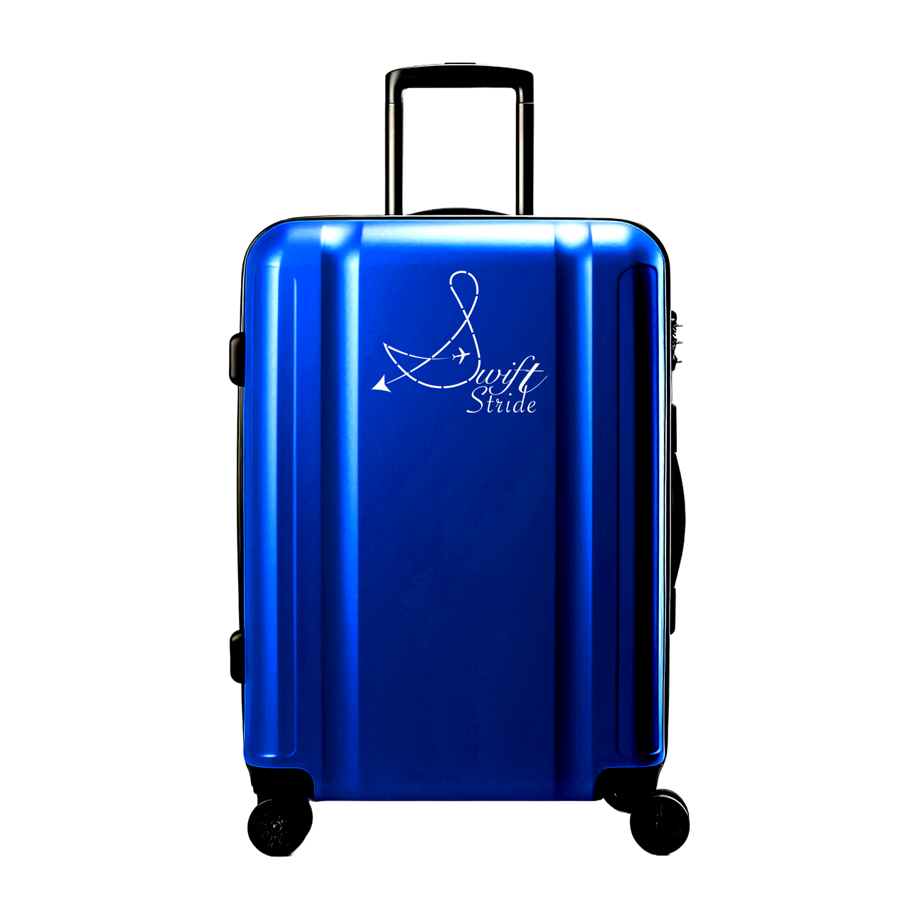
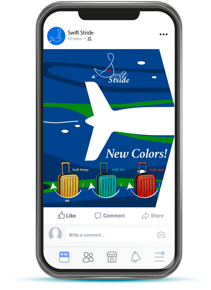
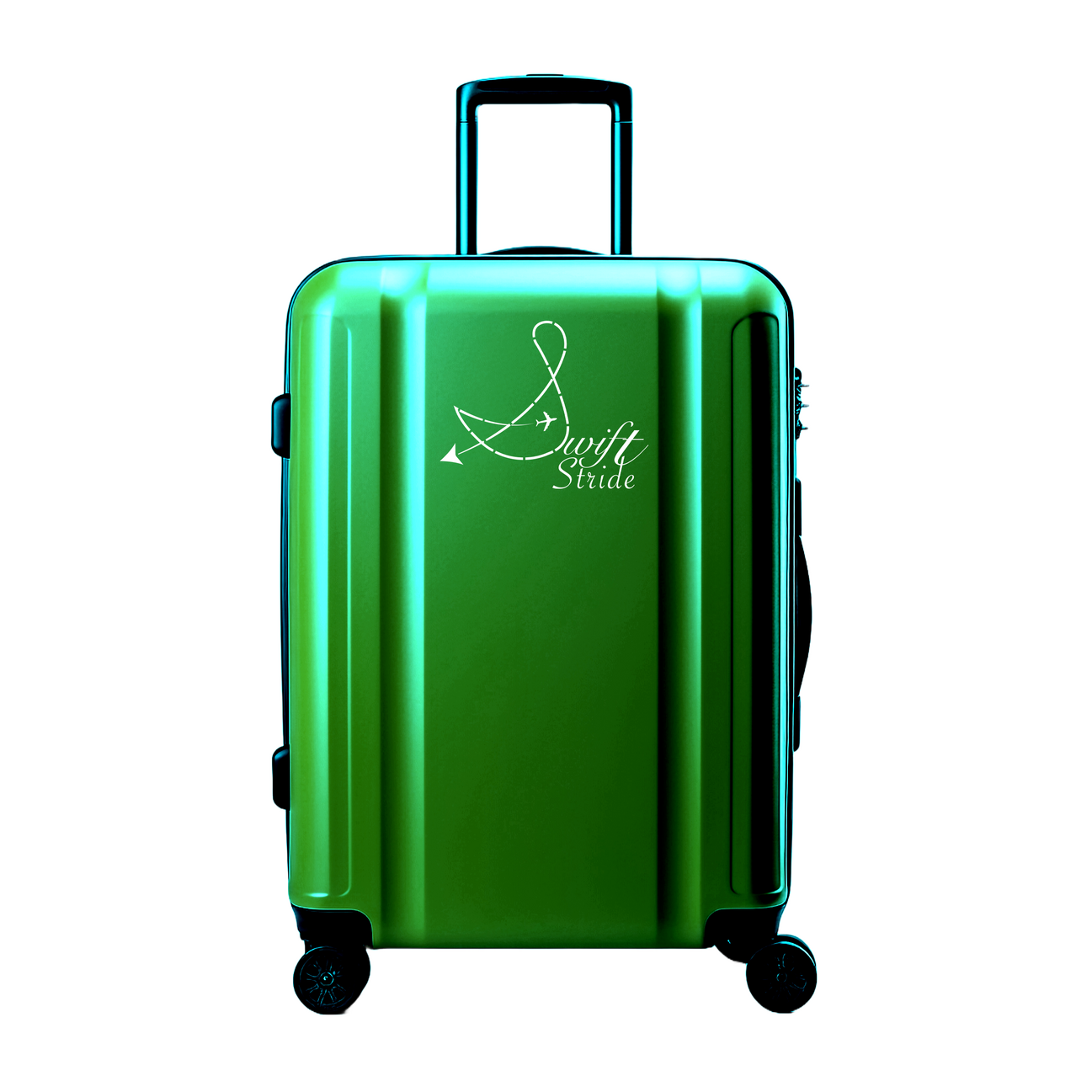
Swift stride
This project was developed as part of a college design assignment with a fast-paced timeline, challenging me to quickly conceptualize and execute a strong, original brand identity. Working under a tight deadline required efficient ideation, clear visual direction, and intentional design choices that could communicate the brand’s message at a glance!Swift Stride takes luggage beyond function and turns it into a statement. Inspired by movement, speed, and the experience of flying, the brand introduces a dynamic new vision of travel gear. Designed to catch the eye and spark curiosity, Swift Stride invites travelers to see their luggage not just as something they carry, but as part of their journey through the skies!

photography
Feel free to view some of my projects below!


Feel free to view some of my projects below!


Feel free to view some of my projects below!


Feel free to view some of my projects below!


Feel free to view some of my projects below!


Feel free to view some of my projects below!


Feel free to view some of my projects below!


About me!
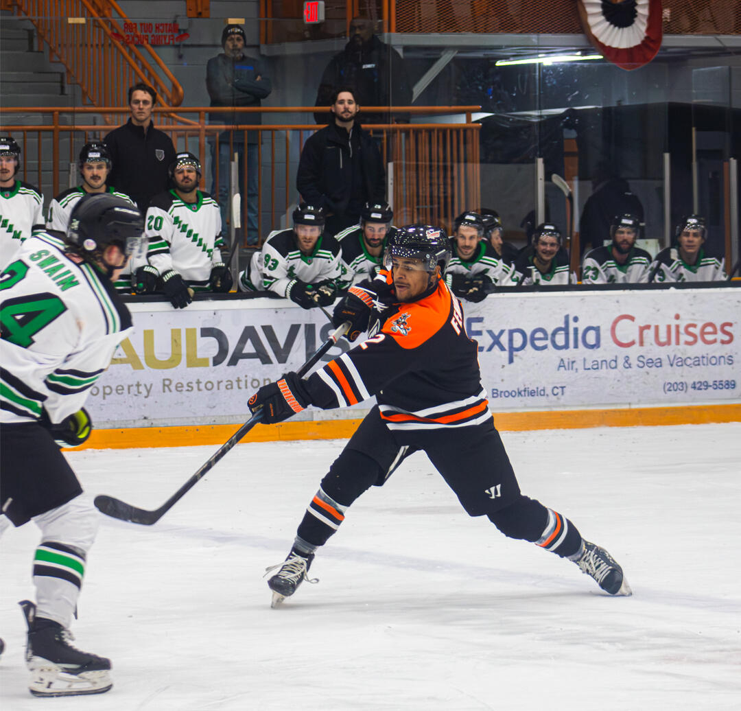
My name is Andrew Steisel - a graphic designer, photographer, and videographer passionate about bringing bold ideas to life. From logos and social content to high-end photo and video work, I’m all about clean design, strong visuals, and delivering work that makes an impact.I’ve been creating for years, combining creative direction with technical skills to help brands, creators, and businesses stand out.What I Do:Graphic Design: I specialize in branding, logo design, and social media content that’s sharp, modern, and built to connect with your audience.Photography: My photo work focuses on clean, professional shots—whether for personal branding, products, or events.Videography: From planning to editing, I create video content that’s high-energy, well-paced, and designed to leave a lasting impression.Mission:To help brands and individuals visually express who they are through strong, intentional design, stunning imagery, and creative video content—while making the process easy, personal, and impactful.Values:Creativity – I believe every project deserves a unique, original approach.Precision – Details matter, both in design and execution.Reliability – I take pride in clear communication, consistency, and meeting deadlines.Passion – Whether it’s design or hockey, I bring full energy and commitment to everything I do.Fun Fact:I played soccer for over 10 years and now spend my free time as an ice hockey goalie. That fast-paced, focused mindset plays a big role in how I work—quick, precise, and ready to adapt under pressure.Let’s Work!Whether you're launching a brand, refreshing your content, or need help standing out—I’m here to bring your vision to life with style and purpose. Let’s create something great together.

Contact me!
Got questions or need a hand? Just fill out the form below—I’ll get back to you as soon as I can!
Thank you
Thank you for reaching out!